The Human Risk page
A client’s CISO emails you: “Who at our company is the biggest security risk right now?” The Human Risk page is where you answer that — aggregate scores across every user at the client, ranked, with the four signals that drove each score visible at a glance.
It’s also where you go when planning reinforcement training, prepping for a QBR, or just doing routine health checks on a client between scheduled reports.
Where this lives
Section titled “Where this lives”Open the client → Risk in the left nav. The page header reads “Human Risk — Aggregate risk assessment across all signals.”
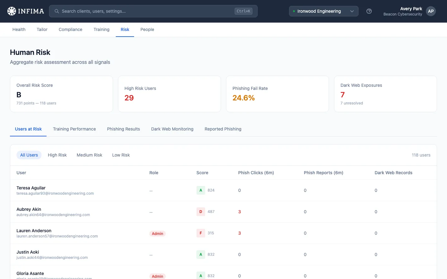
The four KPI cards
Section titled “The four KPI cards”Top of the page. Each one is a button — click it and you drop onto the relevant tab pre-filtered to that slice.
- Overall Risk Score — a letter grade (A through F) representing the average score across every user at this client, with the user count.
- High Risk Users — count of users currently in the “high risk” bucket. Goes red when above zero.
- Phishing Fail Rate — overall click-through rate on phishing tests over the rolling 90 days. Green when ≤5%, warning above.
- Dark Web Exposures — count of users with at least one breach hit. Only appears when Dark Web Monitoring is enabled (per-client + partner master switch). Subtitle shows how many unresolved records remain.
The tabs
Section titled “The tabs”Five tabs sit below the KPI cards.
Users at Risk
Section titled “Users at Risk”Per-user table — name, role, risk score (letter + number), phishing clicks in the last six months, phishing reports in the last six months, dark web records (if DWM is on).
Filter chips at the top: All Users, High Risk, Medium Risk, Low Risk. The thresholds are visible by clicking each chip and watching the table contract — the boundaries reflect what the table itself uses to bucket users. Clicking the “High Risk Users” KPI card jumps you here pre-filtered.
Click any row to open that user’s full risk profile (see Per-user drilldown below).
Training Performance
Section titled “Training Performance”Four mini-cards at the top — Total Users, On Track %, Action Required (overdue user count), Avg Completion % — then a per-user table with department, status (Up to Date / Due Soon / Overdue), completed-of-assigned course counts, completion percentage with a progress bar, next due date, and on-time completion rate.
This tab matches what the Training Performance PDF report covers — same data, browsable in the dashboard.
Phishing Results
Section titled “Phishing Results”Three cards: Overall Fail Rate, Weakest Category (the template that’s getting the most clicks), Report Rate (how many users are flagging tests).
Below: Results by Category — every phishing template type sent to this client over the rolling 90 days, with sent / clicked / fail-rate / reported / report-rate per row. Sortable visually by the color-coded fail-rate bars.
If any user clicked a test in the last six months, a Users Who Clicked table appears below — highest click-count first, with their current risk score next to each row.
Dark Web Monitoring (when DWM is on)
Section titled “Dark Web Monitoring (when DWM is on)”Three cards: Exposed Users, Total Dark Web Records, Critical Users (anyone with a password breach or high-severity exposure).
Below: per-user breach table with totals, unresolved count, highest-severity tier (Critical / High / Medium / Info), and whether passwords were exposed. Click into any user to see the breach detail and resolve actions.
Reported Phishing
Section titled “Reported Phishing”Two cards: Reported (90 days) count, Report Rate.
Below: list of every simulation a user has flagged in the last 90 days — name, subject, date.
This is the “your users are paying attention” tab. A healthy report rate (≥20%) means your training is landing.
Per-user drilldown
Section titled “Per-user drilldown”Click any user row in any tab and you land on their personal risk profile.
What you can see:
- Their risk grade at the top, alongside the raw score.
- Their role — Admin / Executive / HR / Finance / Standard. The role affects how the score interprets the user’s activity; partners can change it here with the role picker (the change saves immediately).
- Their training curriculum — every course assigned, due dates, completion status, and the tier badge (Required / Core / Recommended / Elective).
- Their phishing history — every test they were sent, with the status of each: Sent, Opened, Clicked, Reported, Credentials Submitted, Attachment Opened. Color-coded so the bad outcomes stand out.
- Their breach detail (when DWM is on) — every breach the user’s email appears in, with tier badges (Password / PII / Info) and a per-breach Resolve button.
What you can do:
- Send a training reminder — one-off “you have training due” email to this specific user. Standalone from the automated reminder rotation.
- Resolve a breach — confirm the user has rotated their password / updated the affected account, mark it resolved. Resolved breaches stay visible but drop out of the active count.
- Change the user’s role — promotes Standard to Executive, demotes Admin to Standard, etc. The role affects the score immediately on the next recalculation.
- Assign an additional course — link in the page header to the assignment surface.
How risk scores work
Section titled “How risk scores work”The score is higher is better. The label translates:
| Grade | Direction |
|---|---|
| A | Healthy. No intervention needed. |
| B | Healthy. Routine monitoring. |
| C | Attention needed. Investigate the user’s recent activity, consider a targeted reinforcement nudge. |
| D | Active intervention. Add training, run a 1:1 phishing test, get them and their manager in the loop. |
| F | Active intervention required. Treat this as a near-incident risk. |
What moves a score
Section titled “What moves a score”Each signal moves the score in a direction:
- Failing a phishing test (click, credentials submitted, attachment opened) — score drops.
- Reporting a phishing test correctly — score rises.
- Completing assigned training — score rises. On-time completion is better than late completion.
- Falling behind on training — score drops the longer the user is overdue.
- A new dark web breach hit on the user’s email (when DWM is on) — score drops. Password exposures are treated as the most severe.
- Resolving a breach — partial recovery; the user still has the historical exposure but their active score reflects the resolution.
- Promoting the user to Admin / Executive / HR / Finance — recalculates with higher sensitivity for those roles. Mistakes by higher-privilege users matter more in the score.
Scores update automatically — there’s no “Recalculate Now” button to press.
You’ll know what you’re looking at when
Section titled “You’ll know what you’re looking at when”- The Overall Risk Score card’s letter grade matches the average of the per-user scores in Users at Risk.
- Clicking a KPI card always lands you on the right tab with the right filter (e.g., “High Risk Users” → Users at Risk tab → High Risk filter applied).
- The user counts on the Users at Risk rows match the count next to the filter chips.
- The Dark Web Monitoring tab and KPI card both disappear when the feature is off for the client.
Frequently asked
Section titled “Frequently asked”A user just completed training but their score hasn’t moved yet. Scores update automatically as new activity comes in. Most training completions touch the score within a few minutes. If it’s been an hour and you don’t see movement, refresh the page — the data was probably cached client-side. If still nothing, the completion may not have made it through from the learning portal yet; cross-check the Training Performance tab to confirm the completion is recorded.
What’s a “good” Overall Risk Score for a client? A or B is healthy — most engaged clients land there once their users have been through the initial training cycle. C signals you should check what’s pulling the average down (usually a handful of users clicking phishing tests; the High Risk filter surfaces them fast). D or F at the client level usually means brand-new or significantly behind on training.
Can I export the Users at Risk list? Not directly from this view today. The closest data export is the Risk Overview PDF or Training Status Excel from Reports & Evidence. For a custom export beyond that, the Reporting API returns the same per-user data over HTTP.
Why does one user have a different score than another with the same phishing history? Roles change how the score is calculated. An Admin or Executive with the same click history as a Standard user will have a lower score — the same misstep is more consequential for higher-privilege roles. Check the role badge on each user; if the role looks wrong, you can change it from the per-user drilldown.
A user shows clicks on the Risk page but no clicks in the activity log for that period. The Risk page rolls up the last six months of activity; the activity log defaults to a narrower window (often 90 days). Widen the activity log’s date range and the clicks should appear. If they still don’t, the user may have been re-linked through a recent sync, which can split their history across two records; contact our support team.
Can I change the thresholds for what counts as High / Medium / Low risk? Not at the partner level today. The thresholds are designed to be consistent across clients so the High Risk count on your partner overview is comparable across customers. If you have a use case for per-client thresholds, contact our support team.
What happens when a client admin (the client’s own IT lead) looks at this page? The same view, scoped to their one client. They see their users’ scores, the same KPI cards, the same drilldowns. They can take the same actions (send a reminder, resolve a breach, change a role).
Related
Section titled “Related”- Read phishing activity — the underlying phishing log feeding the score.
- Dark Web Monitoring — the feature that drives the breach signals on this page.
- Generate a report and use the archive — where to pull a PDF / Excel of this data for an executive review.
- Reporting API — programmatic access to the same per-user risk data.